100+ research studies across onboarding, retention, monetization, and audience discovery. Each study started with a product decision. Each finding fed directly into design changes, roadmap decisions, and strategy.
The single insight behind all of it: the same problem looked very different depending on who you asked — a new user, a churner, a female subscriber, or a gym goer. Segmentation wasn't a research method. It was the only way to find the truth.
Period
2022 — Now
Methods
Interviews, usability tests, surveys, JTBD
Role
Head of Design — research direction & activation
By the numbers
100+
Research reports
7
Product areas
1–4 wks
From request to report
Zing Coach is a live product with 1M+ users, recurring subscriptions, and fast-moving quarters. The team could not afford long research cycles. Each study had a clear question, a defined audience segment, and a tight delivery window — from request to report ready in 1–4 weeks. Findings fed directly into sprint priorities, roadmap tradeoffs, and design changes.
What the research kept finding
Four patterns that kept showing up — and changed how we built.
AI personalization promise didn't match product reality
Churners across multiple studies said the workouts felt like prerecorded videos, not a coach that learns — they expected the AI to adapt, not hand them the programming. This gap was the leading cause of switching to competitors.
Female users needed a different product language entirely
The female segment had distinct goals (post-partum recovery, hormonal weight, body tone vs. muscle), different motivations (discipline over motivation, instructor relatability), and different vocabulary. The product spoke to a male-default fitness model.
Onboarding asked too much before earning trust
Usability tests of FTUE screens showed users scanning and skipping summary screens — the science-based feedback felt like data collection, not a coaching moment. Advanced users questioned BMI accuracy; most users didn't scroll the activity or results screens at all.
Subscription cancellation clustered around 3 predictable reasons
~30% could no longer afford it · ~30% expected Body Scan as a core feature, not a paid add-on · ~30% couldn't justify the cost because the product never held them. These weren't random — they were addressable design and messaging problems.
How the operation was structured
Research moved at product speed: 1–4 week cycles from request to report. Studies were structured with a clear question, a defined audience segment, and explicit next steps — not long documents for archiving.
Audience segmentation
Every study defined the target group before recruiting. Segments were built around gender, fitness level (beginner / intermediate / advanced), primary goal, environment (home / gym), and engagement depth. Churn research, for example, split users into 3 engagement tiers and ran separate scripts for each.
Structured qualitative interviews
Most studies used UserTesting.com and Listenlabs with scripted question flows tied to specific hypotheses — not open-ended exploration. Scripts for churners probed the exact moment of intent to switch, competitors evaluated, and what would bring them back. Female segment interviews focused on JTBD.
Usability testing with prototypes
Feature-level studies tested Figma prototypes directly. Workout plans UXR (UXR 11) put a real home screen redesign in front of 25–40 year old users and measured comprehension of Plan vs. Program language, recovery day expectations, and the mental model of "Adapt" versus "Custom" workouts. Findings shaped copy, IA, and the tab structure of the home screen.
From findings to decisions
Reports were structured with a summary, severity grouping, and explicit next steps. Churn research (UXR 15) produced a Q4 action plan assigned by owner: injury-based recommendations released, gym equipment replacement shipped, weights algorithm improvement queued. Research didn't end at the report; it ended at the shipped fix.
Zing Lab — field research
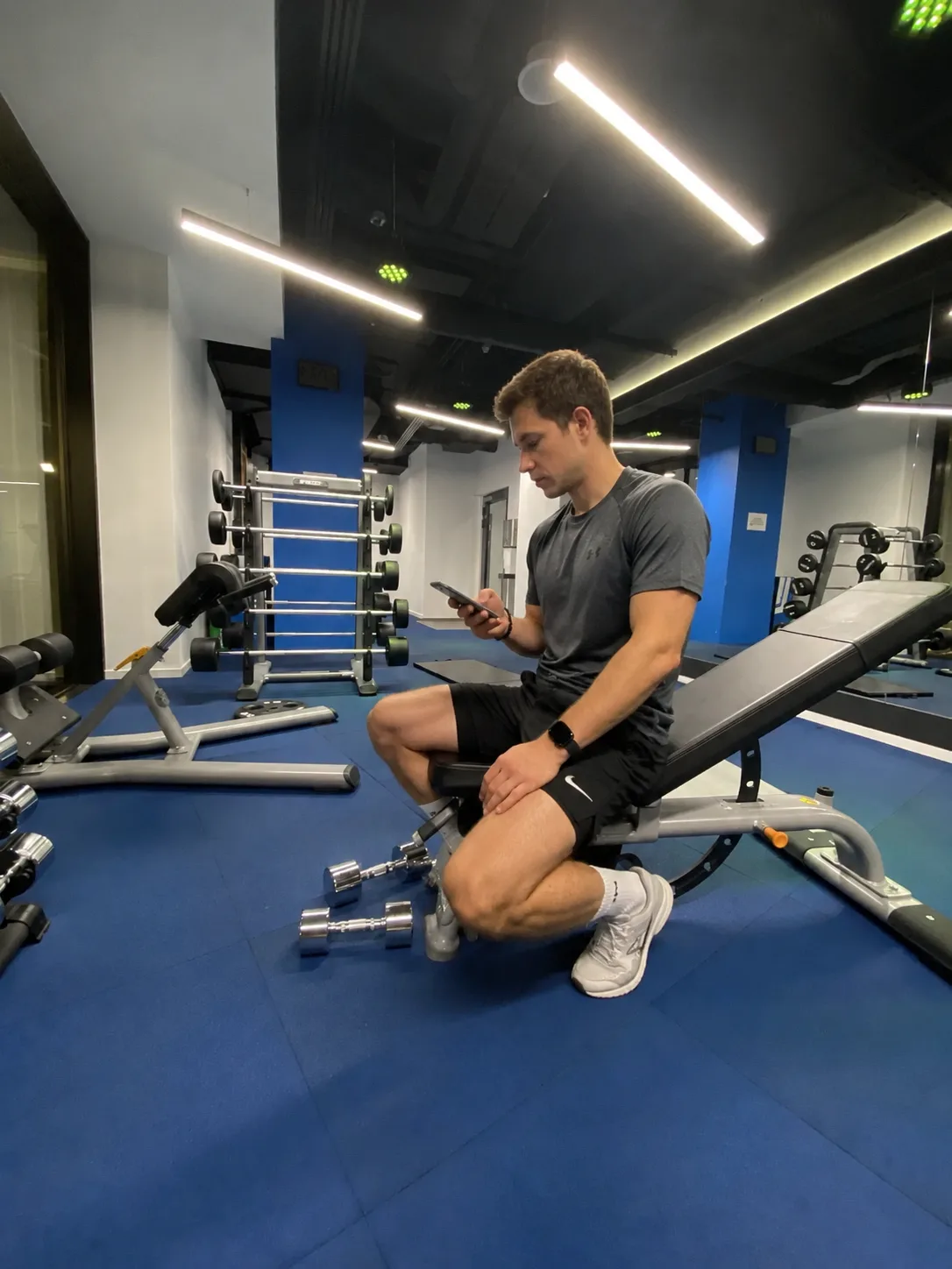
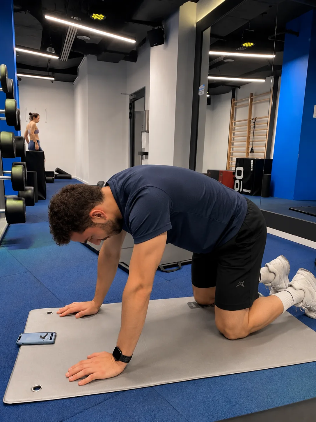
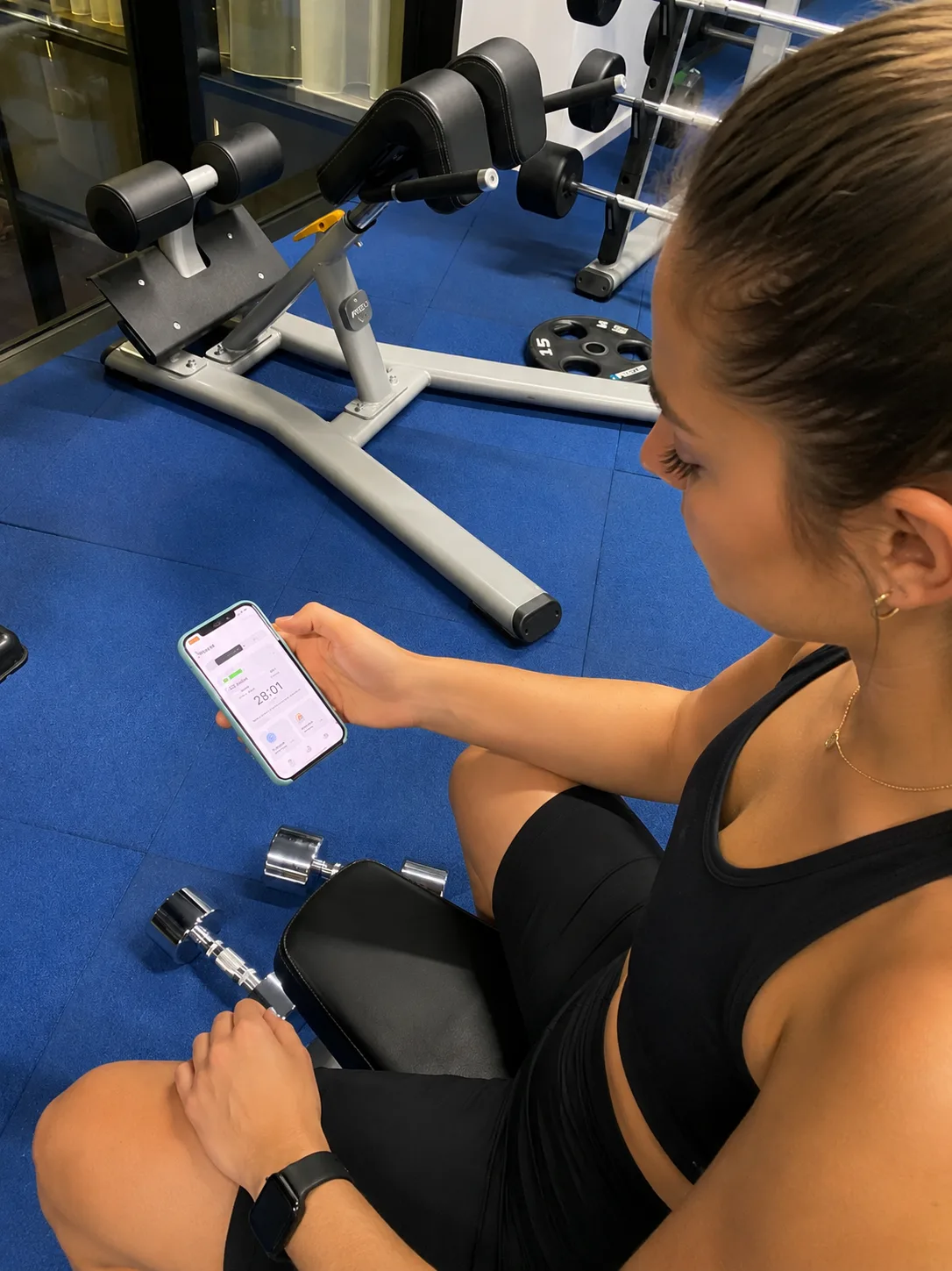
Remote interviews and usability tests told us what users said. Zing Lab told us what actually happened when someone opened the app mid-workout, stood in front of a machine, and tried to follow along.
Format
Moderated in-gym sessions
Locations
Limassol Sporting Center · Warsaw gyms
Participants
50+ (22 men · 23 women · 20–45 yrs)
Issues logged
60 across 6 product areas
Method
Interview + observation
Session structure: lobby intro → download & setup → full workout → retro interview → transfer recording. ~60 min per session. Moderator followed throughout.
Onboarding · 22 issues
The app didn't do what users told it to
Users who selected gym and full-body focus received a home workout for lower body. First workout suggestions included yoga mats and stability balls in a large gym. Onboarding data appeared to have no effect on the plan delivered.
Working Out · 14 issues
Machines on different floors, no way to skip
Supersets routed users across floors mid-workout. When equipment was busy, there was no way to skip or swap in-session. Logging a set gave no visual confirmation — transitioning to the next exercise looked like an error.
Warm-up · 8 issues
Squats before warming up, no explanation why
Users expected mobility and light cardio before lifting. Instead, warm-up included push-ups and squats without context. The "Let's go" CTA after warm-up was visually dominant but non-interactive — the actual button was at the bottom.
Post-workout · 7 issues
Completion screen felt like a dead end
Users wanted heart rate by exercise, lifted weight totals, and a preview of tomorrow's workout. Instead they saw a celebration video that "doesn't create any emotions of accomplishment." The app felt like it forgot the session immediately.
Fitness Test · 5 issues
Test felt like an upsell, not a feature
The fitness test popup interrupted users who were ready to start their workout. No explanation of what the test was for or how it would change their plan. Users didn't see any personalization impact after completing it.
Apple Watch · 4 issues
Watch and app showed different workouts
Watch app didn't sync reliably with the phone. Heart rate jumped in large increments. No haptic feedback. Users glancing at their watch during sets saw a different workout state than the one on their phone.
Key findings
Four cases where research directly changed product direction.
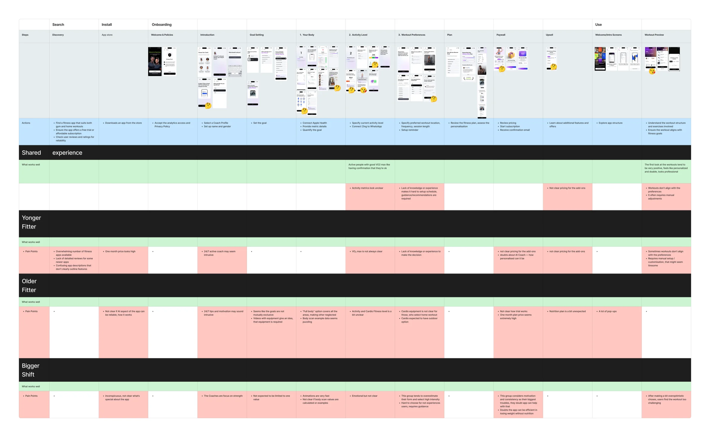
Customer journey: the same funnel, three different experiences
Study
Renewed Personas & CJM · cross-functional initiative with Analytics, UX Research, Product, and Design. The same funnel — discovery, install, onboarding, plan, paywall, upsell, first use — was mapped separately for three segments: Younger Fitter, Older Fitter, and Bigger Shift.
What we found
The same screens produced different friction per segment. Older Fitter users found the "full body" workout option unclear about coverage and the body-scan example data puzzling, and were surprised the app assumed home cardio equipment. Bigger Shift users doubted the app's value from the first screens, then tended to over-select intensity and later found workouts too hard to sustain. One pain point cut across every segment, not just one: unclear pricing for add-ons at the paywall and upsell steps.
Result
One shared journey map replaced scattered, team-specific notes on user friction
Add-on pricing clarity flagged as a cross-segment fix, not a one-off complaint
Segment-specific pain points — body-scan confusion, over-optimistic intensity selection — fed directly into onboarding and plan-building changes
Female segment: The product was built for someone else
Studies
Female Segment Discovery · 2023 — Interviews with women 21–29 and 35–45 on paid fitness apps. Female Funnel · Web & iOS · 2023–2024 — JTBD interviews, usability tests, and copy experiments.
What we found
The job-to-be-done went far beyond weight loss. Life context — post-partum recovery, PCOS, hormonal weight gain — shaped which app she could trust. Vocabulary mattered too: women framed goals as "tone up" and "lose weight in a healthy way," not "build muscle," and valued instructors they could relate to. The funnel defaulted to male fitness patterns in goal language, coach imagery, and exercise selection — women didn't recognize themselves in the product.
"Looking for someone who went through post-partum — it's easier to relate to someone who's already been through your journey."
"My clothes didn't fit me anymore, I was worried — I also have PCOS, so it's for my health first and then aesthetics."
Result
Female web funnel rebuilt and launched
Onboarding quiz rewritten for female segment
Coach imagery and goal language updated across iOS and web
Female web funnel launched as a dedicated acquisition track
Churner UX Research · 2023. 16 in-depth interviews with cancelled subscribers, recruited from 469 web-funnel churners and segmented by engagement tier.
What we found
Churn had two layers. 78% of reachable churners never completed a single workout — many cancelled within days, some the same day they paid. Among users who did train, the core driver was an expectation gap with the AI: workouts felt like prerecorded videos, not a coach that adapts. Users expected the AI to personalize — instead they had to replace exercises, pick equipment, and track progression themselves.
Reason groups
AI & personalization · gym-workout navigation · confusing subscription flow · injuries not accounted for · switching back to offline training.
"Feels like I'm doing the programming, but I want AI to do the programming."
"Not tailored exactly to what I want and need — more like prerecorded videos."
Result
Injury-aware workout recommendations — shipped
Auto-swap for busy gym equipment, keeping muscle focus — shipped
Workout variety by day and muscle-group focus — shipped
Weights algorithm and Strength Score — deployed
Manage-subscription UX and in-app pricing — 2024 roadmap
Cancellations: predictable, fixable clusters
Top reasons cited for cancelling · sub-cancellation study · 2024
Could no longer afford it — intro-to-renewal price jump~30%
Expected Body Scan as a core feature, not a paid add-on~30%
Couldn't justify the cost — didn't stick, ran out of time~30%
Workouts felt boring or low-engagement10–20%
Study
Sub Cancellations · 2024. Cancelled subscribers segmented by workouts attempted (0, 1–2, and 3+ completed).
What we found
Cancellations clustered around money and value. Roughly a third could no longer afford it — often hit by the jump from intro price to renewal. Another third resented paying extra for Body Scan: they were drawn in by it and expected it as a core feature, not a paid add-on. A third couldn't justify the cost because the product never held them — they couldn't stick to the plan, missed days, ran out of time.
Mid-funnel (1–2 workouts)
Churned on plan friction — workouts too long, no easy way to catch up after a missed day, and a robotic coaching voice that felt inauthentic.
Result
Body Scan repositioned in pricing and messaging
Subscription flow and renewal-price transparency improved
Flexible scheduling and catch-up after missed days
What shipped
100+ reports across 7 product areas — onboarding, workouts, female segment, churn, monetization, AI Coach, and competitive. Every report ended with explicit next steps, not conclusions.
UI & Copy
Validated before shipping, not after
"Plan" over "Program" in home screen copy. Adaptation messaging surfaced earlier. Female funnel vocabulary updated. Home screen hierarchy changed after usability test. All shipped without A/B testing the obvious.
Retention
Churn research produced a named action plan
Injury-aware recommendations shipped. Equipment swap mid-session shipped. Weights algorithm and Strength Score deployed. Subscription flow redesigned. Body Scan repositioned. Each traceable to a specific study.
Audience expansion
New segments entered with evidence, not assumptions
Female web funnels, muscle gain onboarding, and AI Coach positioning were built on JTBD interviews and competitor teardowns — not marketing hypotheses. Research ran ahead of the product, not behind it.
What I learned
Research only worked when it answered questions the product was ready to act on. Speed mattered more than sample size. The same finding appearing in interviews, support, reviews, and behavior mattered more than statistical significance.
Best research became invisible — findings shipped and no one remembered they came from a study. The work was in making the discovery simple enough that it felt obvious.